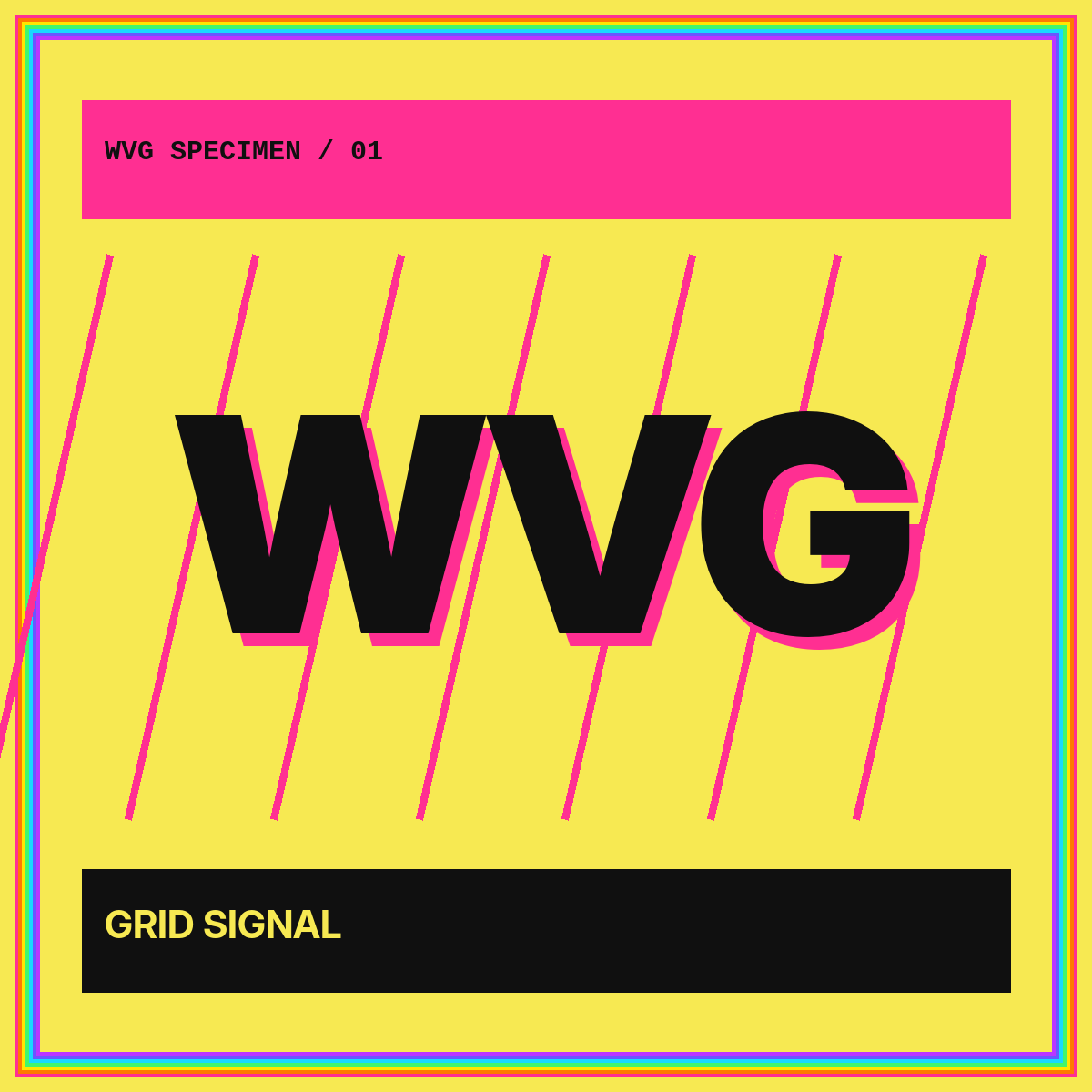
WVG typographic logo showcase
One name.
Twelve voices.
A modular gallery of WVG wordmarks, monograms, and micro marks exploring contrast, width, rhythm, reduction, and digital-first behavior.
Live type studies
A wall of letterform directions.
These HTML specimens use familiar system type categories to compare structure. They are concept studies, not claims of commercial client work or registered marks.
WVG
WVG
WVG
WVG
WVG
WVG
WV
W.
W V G
WVG
WVG
WVG
The comparison method
Change one variable. Preserve the signal.
Each direction begins with the same three-letter sequence, then changes a limited set of attributes: stroke contrast, character width, connection, outline, or display category. Restricting the variables makes the comparison useful.
The strongest concepts keep a recognizable rhythm when reduced. A display treatment can be loud at 1200 pixels, but the system also needs a compact signature and a clear micro mark.
What to inspect
- The silhouette before individual letter detail.
- The spacing around V and the opening of G.
- The relationship between full wordmark and two-letter reduction.
- The behavior on both light and dark surfaces.
Rendered specimen cards
Six social-scale interpretations.
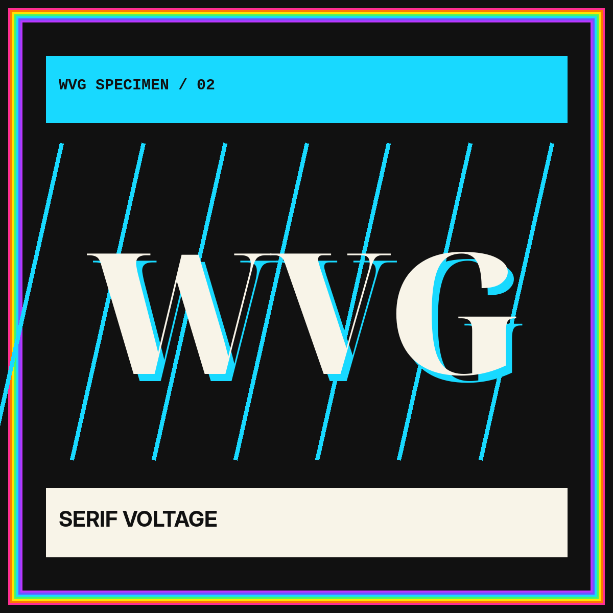
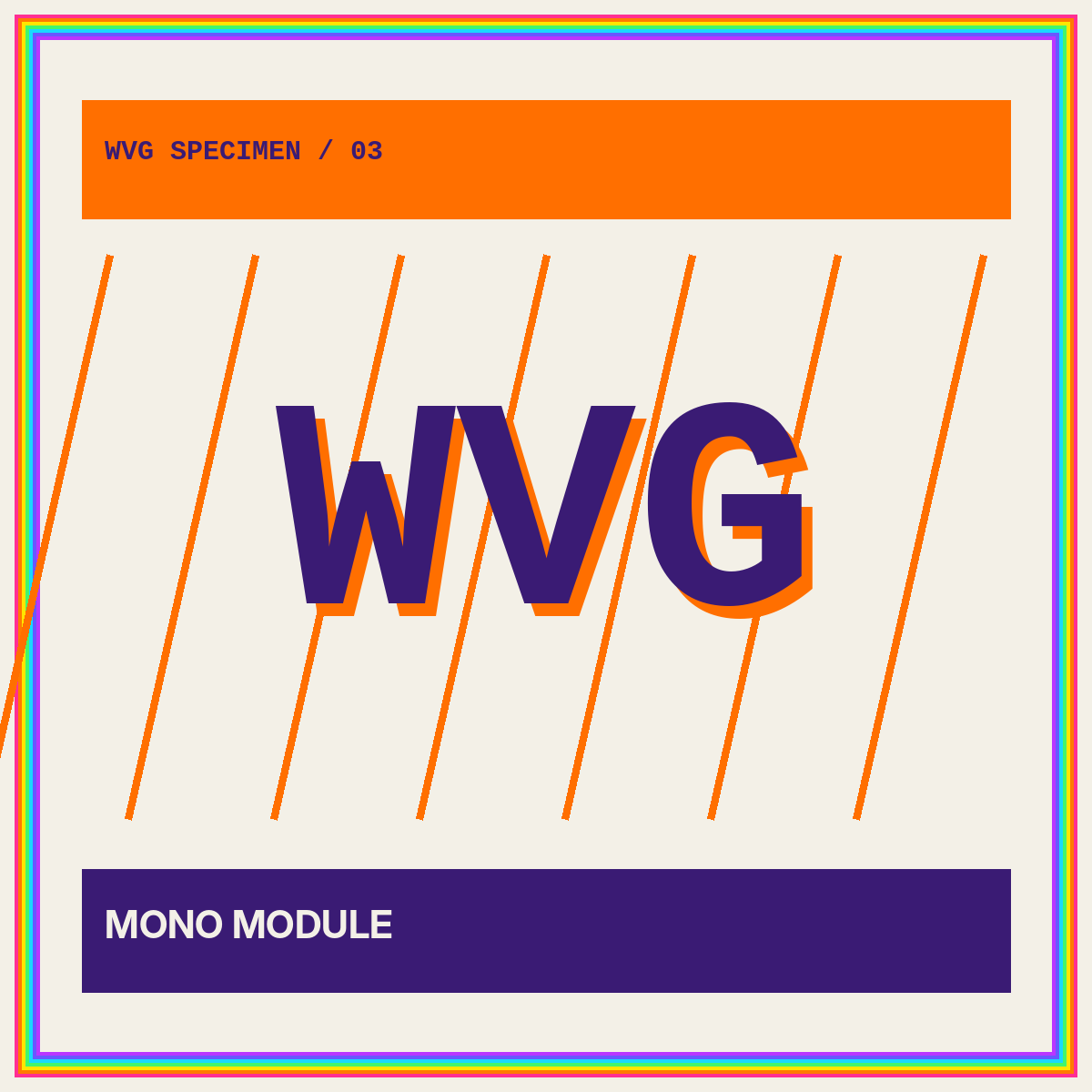
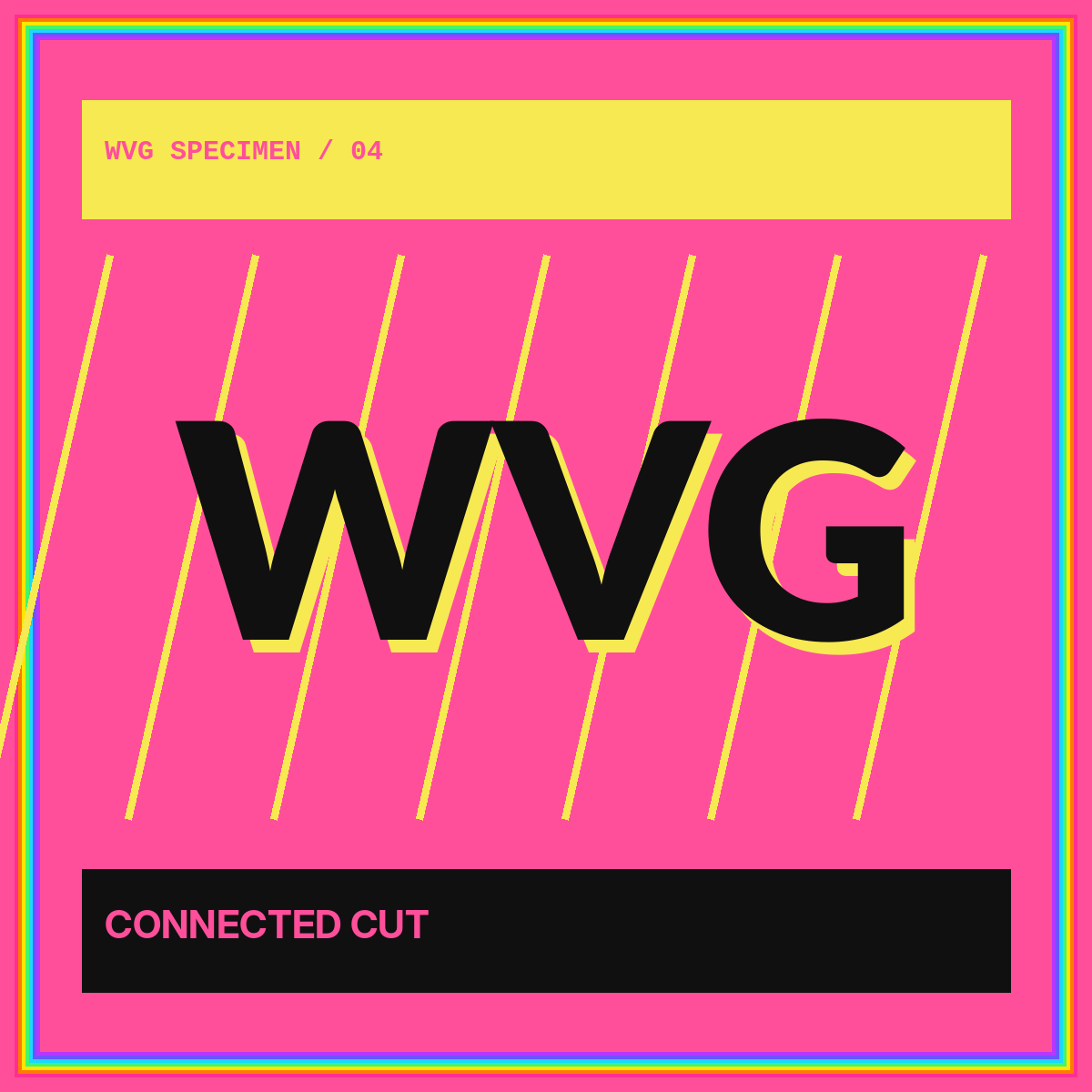
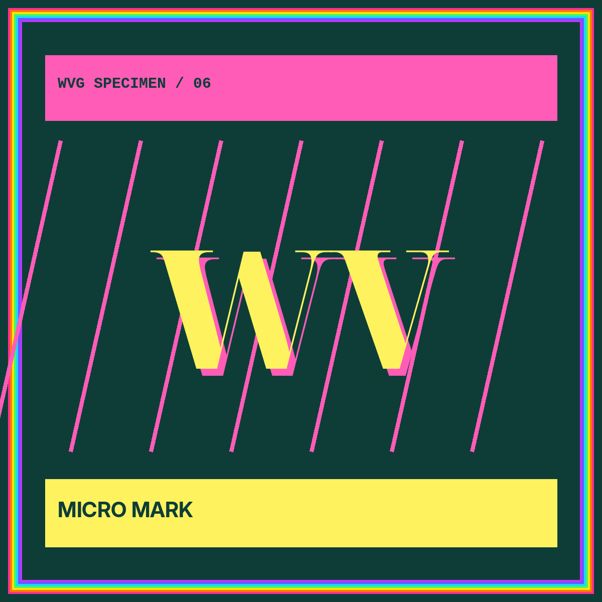
Original square compositions show how a wordmark can extend into launch art, editorial covers, and campaign graphics without losing its typographic core.
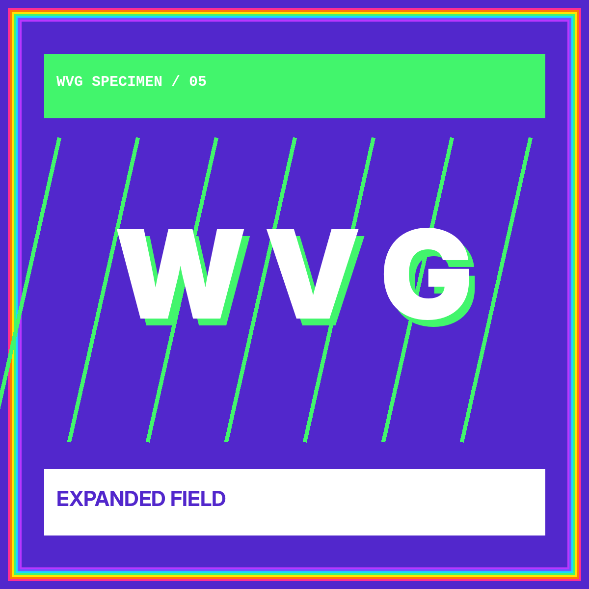
Display master
The fullest expression for hero areas, editorial covers, and high-impact brand moments.
Read about small-size testing →Compact signature
A shorter, calmer version for navigation, product shells, documentation, and partner listings.
Build a responsive logo ladder →Micro mark
The simplest recognizable gesture for favicons, app tiles, avatars, and tiny interface badges.
Review the asset framework →