Recognition
A strong identity begins with one memorable structural idea and protects that idea across scales.
See the specimens →About WVG.xyz
WVG.xyz is a typographic logo showcase and editorial resource devoted to compact wordmarks, responsive identity families, and practical digital brand systems.
Purpose
The project begins with three letters because a constrained name exposes the decisions that matter: silhouette, rhythm, spacing, contrast, reduction, and context. Every specimen asks how the same signal can live in a hero, a product header, a social card, and a favicon.
The journal extends that question into system design. It covers accessibility, variable fonts, SaaS identities, developer trust, launch-page hierarchy, Web3 branding, and clean production handoff.
Three commitments
A strong identity begins with one memorable structural idea and protects that idea across scales.
See the specimens →Expressive type still needs contrast, live text, flexible spacing, useful labels, and stable reduced-motion behavior.
Read the accessibility guide →Clean files, components, naming, responsive rules, and real examples determine whether a logo survives launch.
Use the handoff checklist →The name
Three angular letters create immediate typographic tension: repeating diagonals in W and V, then the round-and-horizontal logic of G. The .xyz domain supports the project’s experimental, digital-first character.
The site uses that compact source material to compare many visual voices without pretending that one style is universally correct.
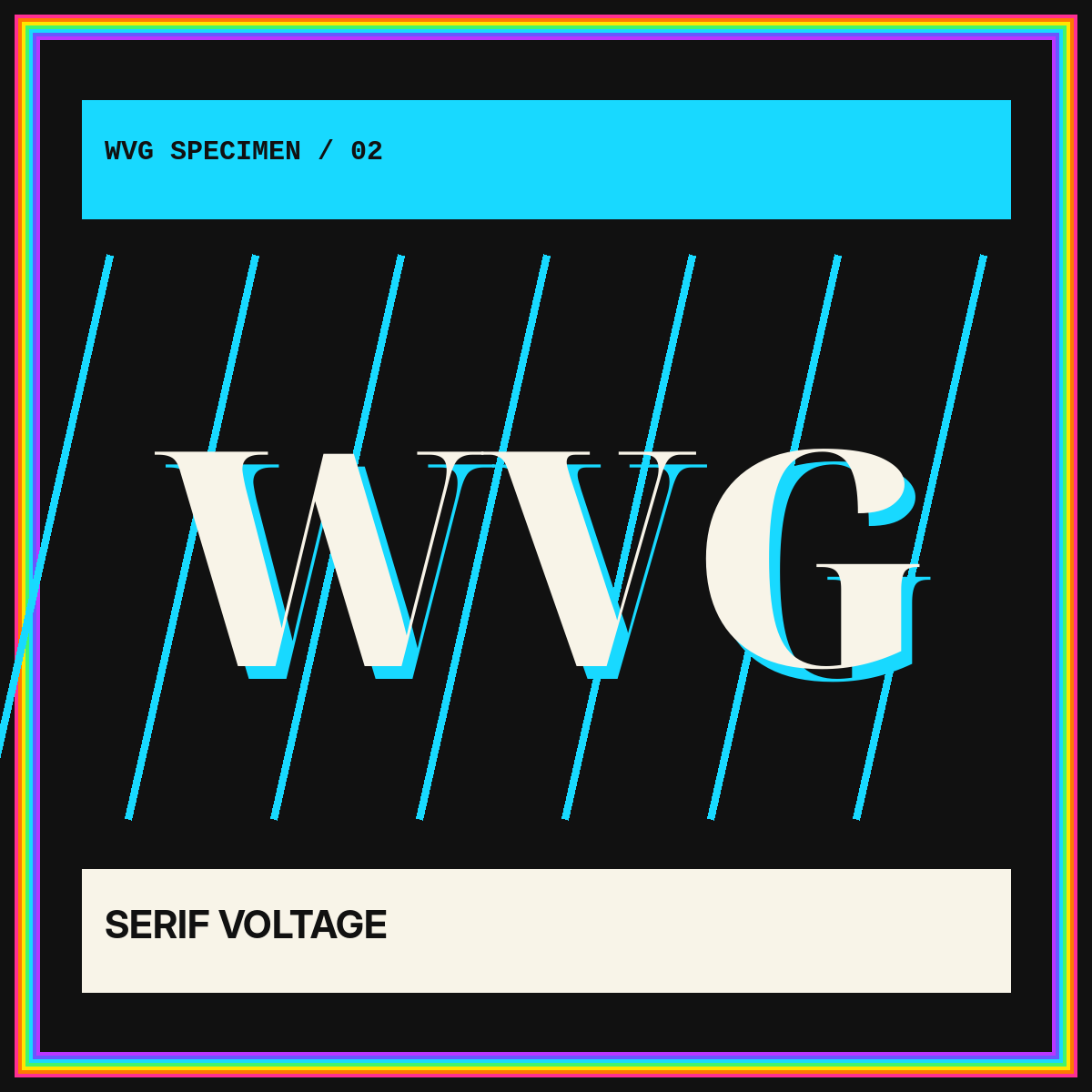
One sequence can feel editorial, technical, playful, formal, compact, or expansive. The system decides which voice belongs to which context.